Community
COA Has a Whole New Look
Did you know? In our more than forty-year history, the Council on Accreditation (COA) has only had three logos—the most recent being the COA shield that launched in 2012 (which was an adaptation of a 2002 version). So, we thought with all the excitement surrounding our 2020 Edition standards, coupled with welcoming our new president and CEO, that the time was right to give our branding a refresh.
It was not something that we took lightly and many, many months of planning and design went into getting it just right. We wanted to make sure that we were remaining true to our roots, but elevating the look and feel to be more fresh, modern, and meaningful.
Welcome to the new COA!

Behind the logo
The logo focused on two key areas: the mark and the color palette.
The mark is now a more abstract symbol, shifting the focus from us and refocusing priority on the work and the organizations we support. If you look closely, you will notice that the ribbon—a symbol of achievement and excellence—is comprised of the letters C-O-A. This is meant to evoke feelings of pride and is open to individual interpretation. Some see a doorway or hallway, signaling a journey, process, or movement—much like our accreditation process itself.
Color your world

We utilized color theory to help us find the perfect palette that would not only be pleasing to the eye, but also rich in meaning and emotion. We landed on a light blue to purple gradient, which adds excitement and a sense of modernity…but there is so much more to it. Purple, a non-dominant color, signifies mastery and excellence, but also compassion. Blue evokes feelings of trustworthiness, wisdom, serenity, peace, and security. Combined, they perfectly convey our mission and purpose, while representing strong ties to our founding organizations and service areas.
Engage. Empower. Evolve.

We have also, for the first time, incorporated a tagline into the mix: Engage. Empower. Evolve. This tagline is a nod to our past while looking towards the future.
Engaging organizations as partners is a fundamental part of our DNA. We empower organizations to be efficient and effective so they can provide best-in-class services to the clients and communities they serve. Accreditation is also not a final destination or an end to a means. It’s an evolution. We continually push organizations to evolve and improve.
So, when you put it all together, the tagline truly speaks to our approach to organizational accreditation. Not to mention alliterations are fun!
Extra, extra! New credentialing seal

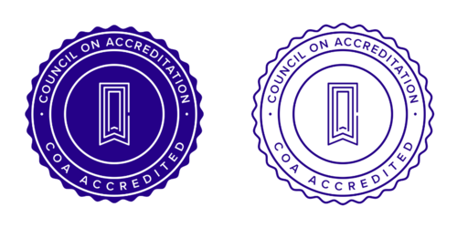
We realize achieving accreditation isn’t easy—it’s a true accomplishment. We wanted to give organizations a way to signal that they are COA accredited and show off their hard work and commitment to excellence. That is why we developed a special credentialing seal for accredited organizations use as a beacon of their accomplishment (rather than just using our logo).
The seal can be used across all organizational collateral (business cards, letterhead, e-mail signatures, etc.). Accredited organizations interested in learning more about acceptable use can request our new promotional toolkit, which we’ll link to on the launch of our new website.
Thank you
Thank you for being part of the COA community. We hope you are as excited by our new look as we are! Please excuse any materials with our previous logo that you might come upon as we work on getting everything switched over; we are working hard to get the updates your way.
Should you have any questions regarding the use of the seal or COA logo, please do not hesitate to reach out to Kelsey Risbrudt at krisbrudt@coanet.org.


