It is comforting to believe we know ourselves, our community, the universe, and our place in it. How else could we get out of bed every morning? That said, we must admit that much of our knowledge is inherited or built on an imperfect (and sometimes dangerous) foundation of experience and a priori reasoning.
a priori (a pri-o-ri): relating to or denoting reasoning or knowledge that proceeds from theoretical deduction rather than from observation or experience.
This is what excites me about data. Can we call it salvation? When collected and analyzed properly, data removes our subjectivity and can offer a neutral, reliable view of the world – if only a miniscule slice of it. Data is the heart of COA’s performance and quality improvement standards, and drives human service providers to continually monitor performance and investigate flagging or abnormal measures. Being deep in the data revolution, we now have unprecedented access to data about the world outside of ourselves and our organizations – critical for human service providers who have a special mandate to know and respond to the communities they serve.
The following are some of my favorite sources of public data relevant to human service providers. May you find refuge and transformation within them!
Data USA
The U.S. government collects lots of data. Lots of it. And most of it is publicly available – though likely raw, disorganized, and inaccessible to anyone without the skills to process it. Data USA connects to these sources of government data and makes them consumable by all:
- Natural-language generation translates data into plain, simple statements; each page feels authored by a human hand.
- Beautiful visualizations show trends over time or communicate complex datasets.
There’s a whole lot here, too: data on universities, colleges, and education opportunities; demographic data on cities, counties, ZIP codes, and states; job and employment data; medical and healthcare data; and more. Enter in your city’s name and see what happens. But Data USA does something remarkable by using its data to create local, state, or national benchmarks. For example, its natural-language generation algorithm produces this statement about Polish speakers in Chicago, IL:
When compared to other census places, Chicago, IL has a relatively high number of residents that are native Polish speakers. In 2015, there were 49,464 native Polish speakers living in Chicago, IL, approximately 9.4 times more than would be expected based on the language’s frequency in the U.S. more broadly.
Honestly, there is so much here. I recommend setting aside 30 minutes to deeply explore this unbelievable service.
How can human service providers use this data?
Research the demographic profile of your city, state, or ZIP code to ensure your client engagement practices are culturally nuanced. Are your materials translated into all local languages? Is there an area of the city more likely occupied by your target clients and so more deserving of time and resources?
Compare your client demographic data to the demographics of your service area. Is it possible that one or more groups are missing out on your services?
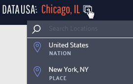
Use the compare function to analyze the differences between your service communities; to compare locations, click the icon shown below and select another location for comparison.
Individuals seeking services have often been fighting a long, lonely battle. Bolster your intake process by sharing relevant community data with service recipients to contextualize and destigmatize their experience. For example, a substance use treatment program could use the Excessive Drinking Prevalence measure found in the Risky/Harmful Behaviors section when serving individuals struggling with alcohol dependency.
Learn about basic measures of health and safety such as insurance coverage, medicare enrollment, and prevalent health conditions via the Health & Safety section of each location page.
Discover broader economic trends like this chloropleth on the poverty rate by county across the nation.
Nonprofit Finance Fund’s State of the Sector Survey
Since 2009, the Nonprofit Finance Fund (NFF) has run the State of the Sector survey to engage nonprofit organizations across the nation about their financial security and beyond: challenges facing their organization and their clients, opportunities they see in the next year, their use of program metrics and outcomes data, and more.
The 2018 survey results were affirming and surprising in equal measure. I’m not surprised that offering competitive pay is a top challenge reported by respondents, but that 67% felt the U.S. government made their clients’ lives harder? That’s shocking.
Want more? Tiffany Langston, Associate Director of Knowledge & Communications at NFF, provided a wonderful synopsis of the report, its function, and their findings in Data for Change: Nonprofit Leaders Raise Their Voices about the State of the Sector.
How can human service providers use this data?
Benchmarks are woefully scarce in the nonprofit/human service sector. Compare your organization’s performance to other nonprofits using many of the financial health measures found throughout the report. And, use the filters at the top to narrow the results to organizations like yours.
Start a conversation by reviewing the survey data with your team as either an element of your annual/strategic planning or simply as a team building exercise. Pause and reflect on each relevant question: what is the state of your organization and how could this impact your ability to deliver quality services? Do the findings reflect your neck of the woods? Why or why not?
Have an honest conversation about your organization’s theory of change, logic model, or outputs and outcomes measures. Are you, like 41% of respondents, operating without a theory of change or logic model? Do you, like 21% of respondents, not collect outcomes measures? How will this impact your ability to win grants in the future?
Leverage this data in conversations with policy makers and funders. Does your organization, like 60% of relevant respondents, receive late payments from your state? How does this inhibit or complicate your operations?
United States Census Bureau
The majority of the data output from the Census Bureau is aimed at researchers and other government entities and often not presented in an easily-consumable form. I recommend joining the Census Bureau’s mailing list for regular updates on gems like The Opportunity Atlas. This interactive map shows “the average outcomes (e.g., earnings) of children who grew up in each neighborhood in America, by demographic subgroup (race, gender, and parental income).”
Their Infographics & Visualizations page also has several interesting offers.
How can human service providers use this data?
Basic data on the communities served by human service organizations often reaffirm what front-line staff already know. But, being able to communicate these characteristics using hard data from respected institutions like the Census Bureau can bolster grant proposals, marketing collateral, and appeals to donors.
Forms 990 Data
How could we not talk about that shining ray of transparency, the Form 990? Let’s go beyond GuideStar and look at some fascinating services utilizing and transforming this data into information.
Citizen Audit
Citizen Audit makes the Form 990 look good. Traditional Form 990 data is accessible within a modern search interface and without learning what each schedule means (that’s 2 hours of my life I’ll never get back).
open990
Another beautiful interface for exploring Form 990 data. The layout is a bit simpler than Citizen Audit and shows a year by year comparison of all relevant data points by default.
ProPublica’s Nonprofit Explorer
Though less feature-rich than the services above, ProPublica’s Nonprofit Explorer provides quick and easy access to the text or raw XML versions of an organization’s Form 990 – great if you’re hunting for something in particular and want to execute a single page find across all data.
IRS Master Business File
For you pros out there, the IRS provides a download of all tax-exempt entities. These worksheets, divided into geographic regions (you can also download state-specific versions), contains the most recent Form 990 data on all tax-exempt entities.
How can human service providers use this data?
Benchmarks, benchmarks, benchmarks. Surely you are benchmarking your organization’s financial health against your past performance, but what about your peers? Dig up data on local organizations providing similar services and see how you compare.
Ask questions like:
- How are our financial ratios compared to our competitors?
- How does our CEO’s wage compare to other nonprofits like ours?
- We have 35 board members. Is that normal?
Find other organizations across the country providing similar services (for benchmarking or collaboration) using the NTEE code. The IRS categorizes all tax-exempt entities using this code; it’s a three character code where the first character, a letter, indicates the broad service area while 2 following digits reflect a narrower categorization of services. Find your NTEE code (most human service organizations have a P or F as the leading character), then find others with that same code and a similar revenue size. Use the resources above to dig into their 990 data.
Learn the ins and outs of your own organization – the 990 is typically comprehensive and is always a rewarding read. You might be surprised about what you discover!
Have you utilized any helpful data resources? If so, feel free to share them with us in the comments section!
These recommendations herein are those of the author; they do not constitute a formal endorsement by the Council on Accreditation.
A big thank you to Tristan Keelan of TenEleven Group for this guest post!
The Behavioral Health field is undergoing a data revolution where electronic capture of daily activity is expected to produce reports that demonstrate, among other things, quality. The initial response to this paradigm shift is to have an electronic health record that can capture data, and produce reporting and analytics capabilities that use the data to demonstrate agency effectiveness. While front-end data capture and back-end information reporting are certainly critical elements of the value based care equation, there is still an element of intervention required by your Quality and Compliance staff to ensure that your data has integrity. To achieve data integrity, you need to make sure that you’re collecting your data in a repeatable manner that provides consistent and accurate data.
Find your outcomes measurement tool
One of the best ways to demonstrate value in behavioral health is to adopt standardized outcomes measurement tools. Tools like the CANS/ANSA, PHQ-9, DLA-20, GAD-7, Columbia Suicide Risk Scale, and many others are designed to allow for the measurement of client populations to be viewed in aggregate for the purposes of demonstrating agency effectiveness. However, the integrity of the outcomes data you capture is going to be critical for framing the story telling that is done once your results are in.
3 tips for maintaining outcomes integrity
The three critical elements that you can manipulate to drive data integrity within your outcomes tools all revolve around creating and enforcing repeatable processes. When your processes are repeatable, you can present your reports with foundational context that improves your presentation. This can turn “here are our numbers,” into “We follow these processes and procedures, which we know drive success, and the proof is here in our numbers.” And the second version is much more convincing.
These three elements are:
1. Determine the cadence that outcomes measures will be captured by, and enforce it.
You want to use standardized outcomes measurement tools so that you can find a way to commonly measure success across your patient population as the progress through treatment over time. Normally when we measure patient outcomes over time, we would make the date the tool was administered the X-axis that would drive our visual; however, in the case of behavioral health outcomes measurement at the agency level we cannot do that.
If you were to look at outcomes scores by date, you end up with a mash up of scattered data because clients are not all seen on the same days. For a visual example, look to the PHQ-9 outcomes scores shown in the graph below:

To rectify this and bring your clients into an “apples to apples” view of progress, you must group the scores into the iteration of the form that was administered – first time, second time, third time, etc. When you do that, you bring a focus to what your outcomes look like at the agency level.
The image below shows the same data set, for the same time period, but it is organized with “Administration Number,” as the X-axis to bring the average improvements of client across the agency into focus.

To make this data tell the story you want, you must be able to articulate what your process for capturing the outcomes measurement is. For example, the measure could be administered every time the customer is seen. Or, every 3rd visit. Or, every 3 months (maybe this coincides with treatment plan reviews). Whatever your agency’s choice is, it should be agreed upon, and enforced. From a quality enforcement standpoint, there should be monitoring reports and procedures to follow-up with therapists who have clients fall out of the agency defined outcomes measurement procedures.
Those monitoring reports can also be run historically to determine how often your process is falling outside the desired timeframes, and thus how far off your data integrity is from the desired. If your monitoring reports show that your clinicians are administering the PHQ-9 at different points in treatment for each client, you will have a low data integrity.
Your agency should strive to be able to speak to outcomes in terms of the example phrase, “the positive trend in PHQ-9 scores reflects our process to administer the measurement tool within 14 days of the treatment planning due date, which we achieve 99% of the time.”
When your Behavioral Health agency can add these types of process statements in conjunction with positive trending outcomes reports, then your value proposition appears substantially stronger to your audience.
2. Acknowledge outcome drift – respect the anchors and keep them front and center
Your clinical staff wants their clients to improve; that’s why they got into this business in the first place. However, this presents a common problem for clinical staff who administer scoring tools. Because the desire is for the client to improve, the previous score can often replace the scoring anchors in the subconscious of the person doing the scoring.
For example, consider the following simplistic version of a hypothetical 3 point symptomatic scale.
In the past month, how often did you experience feelings of anxiety?

In our example, let’s assume the client has scored a 2 on the past two administrations of the tool. The therapist can begin to rationalize that while the client is exhibiting signs that reflect a 2 = Some of the Time, they seem to be doing better overall. Instead of marking a 2 for the third time in a row on this question, the therapist can begin to use the desire for improvement to justify marking a 1 = Very Little because of the appearance of overall improvement.
This type of “Anchor Drift” is natural and should not prevent the use of standardized outcomes tools, but rather should be protected against. There can be a tendency in EHR software systems to streamline forms in a way that removes unnecessary elements that may have existed in the original paper version. This is where it helps to combat that tendency to drift toward improvement by making the anchors present on the form every time it is completed.
In this case if our anchors, “Very Little,” “Some of the Time,” and “All of the Time” are right next to the questions, it will help to subconsciously override the client’s previous score as the anchor. Stripping out the anchors on an electronic form seems like an efficiency gain of space on the screen, but a smart EHR will keep outcomes anchors present on the form to hold the integrity of the tool above the well-meaning desire for clients to improve.
3. Periodically audit your outcome tool with self-assessments
In conjunction with the previous effort to maintain integrity to the outcomes anchors, you can enforce an audit of your clinical staff compared against your client population. Introduce the client to the outcomes anchors, and ask them and the therapist to each complete separate versions of the form at the same point in the treatment. Then you can measure the variance between them at the agency, therapist, and client levels.
As with all things discussed thus far, there are multiple ways to conduct this audit, and it’s really all about establishing and maintaining process. You can dictate that a self-assessment audit is performed every fourth administration of the outcomes tool. Or, call for random self-assessment auditing at different points and have the audit reflect a date in time, versus a static stage of the process that moves with time. Both methods demonstrate that the agency is committed to maintaining anchor integrity. If the anchor drift feels strong, the agency can move towards refresher training or other follow-up methods that are meant to always keep therapists scoring to the anchors.
Show off your good work
When presenting data, you want to be able to articulate the procedural steps that your agency is taking to ensure that showing a positive trend line can be taken as a representation of actual client improvement. This can make all the difference between winning a contract or being overlooked despite your good work.
The views, information and opinions expressed herein are those of the author; they do not necessarily reflect those of the Council on Accreditation (COA). COA invites guest authors to contribute to the COA blog due to COA’s confidence in their knowledge on the subject matter and their expertise in their chosen field.

Tristan Keelan
Tristan Keelan is the Marketing Strategist at TenEleven Group. Tristan holds a BA in English from Elmira College and an MBA from St. Bonaventure University. He uses his experiences working in Government, Non-profit National Service, and Banking to bring business process and analytics driven insights to the behavioral health industry.
You can read blog posts from Tristan here.