Benchmark reports are increasingly common in the human services sector, but how do you know if this data is valuable to your organization? This blog post provides an overview of benchmarking and tips for evaluating the quality of benchmark data available to you.
What does a bench have to do with it?
Not much – unless you’re a craftsperson in antiquity. The term benchmark comes from the marks made on wooden workbenches to indicate shoe size (for cobblers), the length of board needed (for carpenters), etc. Today, a benchmark is a summary calculation – typically an average or median – which attempts to tell us what is normal for a metric.
Benchmarking within the human services sector usually comes in 3 flavors:
- Outcomes benchmarks are complex measures of change in behavior, thinking, or status. Examples include permanency in child welfare systems (such as these dashboards from the Minnesota Department of Human Services) or abstinence rate/reduction in use measures in substance use disorder treatment services. They speak to the success of a program, service, or intervention.
- Administration and management benchmarks are measures of organizational health and stability and target human resource management, financial management, governance, and similar activities. Related metrics speak to the foundational elements of an organization on which quality service delivery depends, and include staff retention rate, months cash on hand, or average board attendance rate.
- Fundraising/development benchmarks are measures of marketing and development success and efficiency. Examples include the open rate of an email seeking donations or giving rates by demographic categories. These benchmarks are the most commonly available (often at a price) as they are standard in marketing software solutions and easy to calculate and share.
What makes a good benchmark?
A benchmark is composed of 3 basic elements: the metric, the benchmark value, and the comparison group. You will need a strong definition of each to determine the value of a benchmark to your organization and should expect any quality benchmark report to outline them.
The metric
The metric should be clearly defined with a title, description, purpose, time period, and the underlying formula. Let’s use a common Human Resources measure, staff turnover, as an example:
Staff turnover is the rate of employees who leave an organization and are replaced by new employees in the stated fiscal year. This measure demonstrates an organization’s ability to maintain a stable and qualified workforce and is calculated as: (Total number of employees at the start of the fiscal year minus the total number of employees who left) divided by the total number of employees at the start of the fiscal year.
A well-defined metric is a strong indicator that all participating organizations calculated their figure consistently.
The benchmark value
This is the summary calculation and is typically an average, median, or—occasionally —a range of the sample. Here is a description of each:
- The average or mean is the “typical” value in the data. The average is only appropriate for data with a normal distribution (the bell curve shape) and is sensitive to outliers in the data.
- The median is the middle value in the data. It is less susceptible to outliers and appropriate for data with a non-normal distribution. Not sure what a normal or non-normal distribution is? No worries! The average and median will be extremely close if the data has a normal distribution, so—in any case—the median is always a safe bet.
- A full set of descriptive statistics provide a nuanced but complex view of the data’s distribution; it is the most illustrative method of describing benchmark data but can easily overwhelm most readers. These calculations can include: minimum value, maximum value, average, median, standard deviation, quartiles/percentiles, and the interquartile range.
The comparison group
The comparison group is comprised of the organizations participating in the benchmarking project. Understanding the comparison group is more than knowing the number of organizations which submitted data to the project; their overall demographic profile is the best way to assess the benchmark’s value to your organization.
What is the value of a staff turnover benchmark to a substance use treatment organization if the benchmark was generated using data from 100 arts nonprofits? A benchmark is only as valuable as its comparison integrity: the extent to which the comparison group matches the organization utilizing the benchmark to contextualize its performance. And this is what makes quality benchmarking so difficult.
A well-defined comparison group allows you to gauge the relevance of the benchmark to your organization. To have any value, a benchmarking project must collect a variety of demographic data about the participating organizations. Typical variables include:
- Revenue/budget amount: a general measure of organization size; other measures can include workforce size or average clients served per year
- Location: city, state, region, and/or community types such as urban, suburban, and rural
- Services provided: anywhere from general service categories (child welfare, behavioral health, etc.) to specific program models; this is exceptionally difficult because there are few taxonomies (systems of categorization) for human services
Why is a good benchmark so hard to find?
Generating high-quality benchmark data is a complex, time-consuming task, and, for many benchmarking projects, there is no guarantee of success. A benchmarking project requires the following.
The participants
As stressed above, coding the demographic characteristics of participating organizations is paramount. Other demographic variables typically include organization size (determined by revenue or employee count), location (region, state, and/or city), types of clients served (age, needs, or similar), and – principally – the types of services provided by the organization.
Unfortunately, the only ubiquitous, standardized method of coding human services organizations by services provided comes from the National Taxonomy of Exempt Entities (NTEE) code assigned to all tax-exempt organizations by the Internal Revenue Service (IRS); see a complete list here. However, because this code is determined solely by the IRS, it may not accurately reflect the organization’s actual services.
Well-defined, desirable metrics
The entity leading the benchmarking project must identify commonly-accepted metrics for which participating organizations see a valuable ROI. There must be clear definitions and calculation steps for each metric (yes, the dreaded data dictionary), and participating organizations must agree on their value.
Two-way reporting system
Participating organizations must have a way to provide their data and receive a benchmark report in return. Ideally, this benchmark report is dynamic and displays the data submitted by the organization side-by-side with the benchmark figure.
Quality assurance system
The system to collect and store data must have quality assurance checks to both prevent bad data from entering and identify bad data if it circumvents initial safeguards.
Longitudinal data
The best benchmarking projects will repeat their procedure on a regular schedule and collect data from the same group of participating organizations, or a fluid group of participating organizations with similar demographic characteristics.
Why utilize benchmark data?
There are 4 great reasons to seek out external benchmark data relevant to your organization.
1. Share your success with clients, grant-makers, regulators, and your Board of Trustees
These folks love data, and you love contextualizing your performance. Enriching your reports with external benchmark data can further highlight your successes, pad seemingly-poor performance (“Our turnover rate has risen but is still well under industry benchmarks”), and demonstrate your love of data and participation in the human services world beyond your walls.
2. Feed your performance and quality improvement system
A rich, enmeshed performance and quality improvement (PQI) system is the cornerstone of the Council on Accreditation’s standards and process. From the PQI standard itself:
COA’s Performance and Quality Improvement (PQI) standards provide the framework for implementation of a sustainable, organization-wide PQI system that increases the organization’s capacity to make data-informed decisions that support achievement of performance targets, program goals, positive client outcomes, and staff and client satisfaction. Building and sustaining a comprehensive, mission-driven PQI system is dependent upon the active engagement of staff from all departments of the organization, persons served, and other stakeholders throughout the improvement cycle.
Your organization is likely benchmarking performance already – that is, anytime you look to past performance to evaluate current performance. But finding benchmarks derived from peer organizations further contextualizes performance and pulls your organization out of the limited, sometimes-myopic world of its own data.
3. Get folks talking!
If you use dashboards, you’re probably seeing the same data every day. The line rises; the line falls. The number goes red; the number goes green. Over time, familiarity with the trends in your data can be desensitizing. You understand what is normal and what is not – but all of this happens within the insular universe of your organization.
External benchmark data – and particularly longitudinal benchmark data – gives more context to performance and can reinvigorate data-informed conversations which have faded over time.
4. Set goals and acknowledge high performance
Your performance and quality improvement system craves goals as a driver of performance. External benchmark data can be a powerful tool for pushing staff/programs, but this data can also further celebrate staff/programs performing above the benchmark.
What has been your experience with benchmark data?
Tell us your favorite sources of benchmark data or how you’ve integrated it into your organization’s operations in the comments below!
[vc_row][vc_column][vc_column_text]
“How Do You PQI?”
This is phrase that COA came up with a few years ago to introduce our newest toolkit. As an accreditation insider, we think it’s a clever phrase in that it conveys that:
- PQI is a necessity
- PQI is something that you do and that has motion, and
- PQI is customizable.
(We also like that it rolls off the tongue easily, unlike the word “accreditation.”)
Unfortunately, not everyone is an accreditation insider. We love our acronyms at COA, and use them everywhere–in our standards, in our process, in our technology (shout out to the VIP portal!). But acronyms and jargon can be confusing to anyone not in the know, and create barriers to understanding. “PQI” is no different.
So what is PQI, you ask?
Good question–and a common question we’re asked when staffing COA’s exhibit booth at a conference. The conversation usually goes something like this:
Inquiring person: What is PQI?
Us: It’s the foundation of the accreditation process.
Inquiring Person: Yes, but what does it mean?
Us: “Performance and Quality Improvement.” It’s our name for Quality Improvement or Quality Assurance.
Inquiring person: Thanks. What’s “Quality Improvement”?
Us: On a basic level, we like to say that a PQI system is collecting data about your work, analyzing it, making course-corrections based on the data, and then tracking to see if those changes are working.
Then we usually see a glimmer of understanding in their eyes. We give the inquiring person our PQI Toolkit postcard, and hope that it makes its way to the Quality Assurance/Data Nerd at their agency.
Based on our conversations with stakeholders, in-process organizations, and peers, we at COA know that PQI is can be a conceptual, difficult-to-grasp concept. We also know that agencies need a lot of help developing their PQI systems. This is why we talk about PQI a lot, and why we create trainings and tools to help.
One long-awaited tool is a high-level introduction to PQI for anyone new to the concept. Now when we’re manning the exhibit table and get asked “What is PQI?”, we are thrilled to be able to reply:
“Check out our PQI whiteboard video!”
Transcript
The most effective social service organizations are those that have been accredited to meet the highest standards of quality.
For more than 40 years, the nonprofit Council on Accreditation has partnered with health and human service organizations globally to improve outcomes by developing, applying, and promoting accreditation standards.
COA’s Performance and Quality Improvement standards, or PQI, require organizations to generate and review organization-wide data to establish performance targets that improve services and outcomes for all stakeholders. It’s a comprehensive process that includes working with the entire organization instead of assigning the responsibility for quality improvement to just a few individuals.
Information generated by the PQI system is used to:
- Monitor progress toward achievement of strategic goals and long-term direction,
- Manage programs and operations efficiently and effectively,
- Meet funder requirements to promote the organization and its services throughout the community, and
- Support direct service staff to meet program goals and have a positive impact on people served.
The organization reviews findings and feedback while taking action to:
- Eliminate or reduce identified challenges,
- Replicate good practices,
- Recognize and motivate staff, and
- Improve services for the communities they serve and assist with fulfilling their mission.
And hopefully now you think the phrase “How Do You PQI?” is clever, too.
Want to dig deeper into PQI? Check out our comprehensive PQI Toolkit.
[/vc_column_text][/vc_column][/vc_row]
It is comforting to believe we know ourselves, our community, the universe, and our place in it. How else could we get out of bed every morning? That said, we must admit that much of our knowledge is inherited or built on an imperfect (and sometimes dangerous) foundation of experience and a priori reasoning.
a priori (a pri-o-ri): relating to or denoting reasoning or knowledge that proceeds from theoretical deduction rather than from observation or experience.
This is what excites me about data. Can we call it salvation? When collected and analyzed properly, data removes our subjectivity and can offer a neutral, reliable view of the world – if only a miniscule slice of it. Data is the heart of COA’s performance and quality improvement standards, and drives human service providers to continually monitor performance and investigate flagging or abnormal measures. Being deep in the data revolution, we now have unprecedented access to data about the world outside of ourselves and our organizations – critical for human service providers who have a special mandate to know and respond to the communities they serve.
The following are some of my favorite sources of public data relevant to human service providers. May you find refuge and transformation within them!
Data USA
The U.S. government collects lots of data. Lots of it. And most of it is publicly available – though likely raw, disorganized, and inaccessible to anyone without the skills to process it. Data USA connects to these sources of government data and makes them consumable by all:
- Natural-language generation translates data into plain, simple statements; each page feels authored by a human hand.
- Beautiful visualizations show trends over time or communicate complex datasets.
There’s a whole lot here, too: data on universities, colleges, and education opportunities; demographic data on cities, counties, ZIP codes, and states; job and employment data; medical and healthcare data; and more. Enter in your city’s name and see what happens. But Data USA does something remarkable by using its data to create local, state, or national benchmarks. For example, its natural-language generation algorithm produces this statement about Polish speakers in Chicago, IL:
When compared to other census places, Chicago, IL has a relatively high number of residents that are native Polish speakers. In 2015, there were 49,464 native Polish speakers living in Chicago, IL, approximately 9.4 times more than would be expected based on the language’s frequency in the U.S. more broadly.
Honestly, there is so much here. I recommend setting aside 30 minutes to deeply explore this unbelievable service.
How can human service providers use this data?
Research the demographic profile of your city, state, or ZIP code to ensure your client engagement practices are culturally nuanced. Are your materials translated into all local languages? Is there an area of the city more likely occupied by your target clients and so more deserving of time and resources?
Compare your client demographic data to the demographics of your service area. Is it possible that one or more groups are missing out on your services?
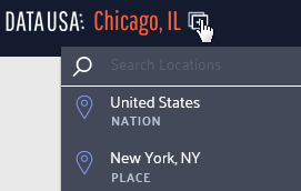
Use the compare function to analyze the differences between your service communities; to compare locations, click the icon shown below and select another location for comparison.
Individuals seeking services have often been fighting a long, lonely battle. Bolster your intake process by sharing relevant community data with service recipients to contextualize and destigmatize their experience. For example, a substance use treatment program could use the Excessive Drinking Prevalence measure found in the Risky/Harmful Behaviors section when serving individuals struggling with alcohol dependency.
Learn about basic measures of health and safety such as insurance coverage, medicare enrollment, and prevalent health conditions via the Health & Safety section of each location page.
Discover broader economic trends like this chloropleth on the poverty rate by county across the nation.
Nonprofit Finance Fund’s State of the Sector Survey
Since 2009, the Nonprofit Finance Fund (NFF) has run the State of the Sector survey to engage nonprofit organizations across the nation about their financial security and beyond: challenges facing their organization and their clients, opportunities they see in the next year, their use of program metrics and outcomes data, and more.
The 2018 survey results were affirming and surprising in equal measure. I’m not surprised that offering competitive pay is a top challenge reported by respondents, but that 67% felt the U.S. government made their clients’ lives harder? That’s shocking.
Want more? Tiffany Langston, Associate Director of Knowledge & Communications at NFF, provided a wonderful synopsis of the report, its function, and their findings in Data for Change: Nonprofit Leaders Raise Their Voices about the State of the Sector.
How can human service providers use this data?
Benchmarks are woefully scarce in the nonprofit/human service sector. Compare your organization’s performance to other nonprofits using many of the financial health measures found throughout the report. And, use the filters at the top to narrow the results to organizations like yours.
Start a conversation by reviewing the survey data with your team as either an element of your annual/strategic planning or simply as a team building exercise. Pause and reflect on each relevant question: what is the state of your organization and how could this impact your ability to deliver quality services? Do the findings reflect your neck of the woods? Why or why not?
Have an honest conversation about your organization’s theory of change, logic model, or outputs and outcomes measures. Are you, like 41% of respondents, operating without a theory of change or logic model? Do you, like 21% of respondents, not collect outcomes measures? How will this impact your ability to win grants in the future?
Leverage this data in conversations with policy makers and funders. Does your organization, like 60% of relevant respondents, receive late payments from your state? How does this inhibit or complicate your operations?
United States Census Bureau
The majority of the data output from the Census Bureau is aimed at researchers and other government entities and often not presented in an easily-consumable form. I recommend joining the Census Bureau’s mailing list for regular updates on gems like The Opportunity Atlas. This interactive map shows “the average outcomes (e.g., earnings) of children who grew up in each neighborhood in America, by demographic subgroup (race, gender, and parental income).”
Their Infographics & Visualizations page also has several interesting offers.
How can human service providers use this data?
Basic data on the communities served by human service organizations often reaffirm what front-line staff already know. But, being able to communicate these characteristics using hard data from respected institutions like the Census Bureau can bolster grant proposals, marketing collateral, and appeals to donors.
Forms 990 Data
How could we not talk about that shining ray of transparency, the Form 990? Let’s go beyond GuideStar and look at some fascinating services utilizing and transforming this data into information.
Citizen Audit
Citizen Audit makes the Form 990 look good. Traditional Form 990 data is accessible within a modern search interface and without learning what each schedule means (that’s 2 hours of my life I’ll never get back).
open990
Another beautiful interface for exploring Form 990 data. The layout is a bit simpler than Citizen Audit and shows a year by year comparison of all relevant data points by default.
ProPublica’s Nonprofit Explorer
Though less feature-rich than the services above, ProPublica’s Nonprofit Explorer provides quick and easy access to the text or raw XML versions of an organization’s Form 990 – great if you’re hunting for something in particular and want to execute a single page find across all data.
IRS Master Business File
For you pros out there, the IRS provides a download of all tax-exempt entities. These worksheets, divided into geographic regions (you can also download state-specific versions), contains the most recent Form 990 data on all tax-exempt entities.
How can human service providers use this data?
Benchmarks, benchmarks, benchmarks. Surely you are benchmarking your organization’s financial health against your past performance, but what about your peers? Dig up data on local organizations providing similar services and see how you compare.
Ask questions like:
- How are our financial ratios compared to our competitors?
- How does our CEO’s wage compare to other nonprofits like ours?
- We have 35 board members. Is that normal?
Find other organizations across the country providing similar services (for benchmarking or collaboration) using the NTEE code. The IRS categorizes all tax-exempt entities using this code; it’s a three character code where the first character, a letter, indicates the broad service area while 2 following digits reflect a narrower categorization of services. Find your NTEE code (most human service organizations have a P or F as the leading character), then find others with that same code and a similar revenue size. Use the resources above to dig into their 990 data.
Learn the ins and outs of your own organization – the 990 is typically comprehensive and is always a rewarding read. You might be surprised about what you discover!
Have you utilized any helpful data resources? If so, feel free to share them with us in the comments section!
These recommendations herein are those of the author; they do not constitute a formal endorsement by the Council on Accreditation.
Developing a quality improvement system is no easy feat. It takes patience, creativity, vision and a fine eye for detail (oh, and did I mention lots and lots of coffee?). Getting started can seem daunting, but it doesn’t have to be so scary. With every major project comes challenges, some of which you didn’t see coming, and that’s all part of what ultimately makes it so rewarding. However, there are some common barriers that keep organizations from staying on track with developing (or significantly revising), their quality improvement system.
1. Differing visions: Compliance vs. quality improvement
A shared, clear vision of what QI means internally is critical. Is your organization solely focused on meeting licensing, funding, and regulatory body requirements, or is it determined to delve deeper to strengthen its practices on a continuous basis? It’s the difference between being compliance-driven and quality-driven. The Health Care Compliance Association defines compliance as “systematic procedures instituted by an organization to ensure that the provisions of the regulations imposed by government agencies are being met.” The operative word here is imposed – the organization is guided by deliverables set by an outside entity. Quality improvement includes aspects of compliance. Joseph DeFeo, author of Juran’s Quality Handbook, views quality improvement as being of “exceptionally high quality, defined only in terms of the organization’s internal standards.” Both compliance and quality improvement are connected to the same end user – the client — but success is defined in different ways.
A quality-driven organization begins with quality-driven leadership. Leadership is responsible for creating a culture of improvement guided by factors beyond the expectations of external entities, and they need to be significantly motivated by internal targets/goals. This requires that leadership embrace transparency, and not disregard information that may cast certain aspects of the organization in an unflattering light. Exposing organizational weaknesses is fundamental to improvement, and leadership needs to be straightforward about it early on as they develop and commit to a definition of QI that will lay the foundation for the work ahead.
2. “We have plenty of time!”
Building a QI system takes time, so it’s better to err on the side of caution and give yourself a lot of it. True, time isn’t always on our side, and often those who oversee QI activities do so on top of other responsibilities. Don’t let time be the enemy; start early, and begin by educating staff on all the moving parts that comprise a quality improvement program. This way they’ll understand why you’re starting twelve months in advance rather than three months prior to the target implementation date.
There are two major phases in this process: planning and implementing. In the planning phase, you need time to develop a work plan, meet with all programs and administrative departments to brainstorm metrics, create procedures, and put all the pieces together. Take into account that brainstorming sessions will likely take place over the span of several meetings. The implementation phase includes collecting, analyzing and reporting data, and meeting with different forums to discuss the information. These exercises shouldn’t be rushed, and may take significant time to complete.
In the implementation phase, it’s important to obtain staff feedback on data reports and analyses to ensure the information is clear, beneficial and useful. To get perspective and efficiently address barriers in the way of advancing your QI system, schedule on-going meetings with departments and programs to get their perspectives on pieces that do and don’t work.
3. Neglecting the power of cheerleaders
The cheerleaders are your champions – those who have informal and/or formal influence within the organization and can push the PQI agenda forward. Your cheerleaders understand the value of quality improvement and can explain its significance to other staff. They provide guidance and foster a culture of improvement by creating spaces for staff to get excited about data. How is this done? Adding QI to meeting agendas, providing additional context to data reports, or exploring obstacles to using data with staff.
Cheerleaders also support QI coordinators by offering tips on how to get certain busy individuals to meet their QI deliverables, or help determine when a task needs to be postponed or expedited. To implement quality improvement, you need eyes and ears on the ground to ascertain the organizational climate as the initiative is rolled out. Establishing a quality improvement system can have its challenges, especially when unforeseen hiccups occur. Champions can help you strategize how to achieve objectives and deal with underlying issues as they arise.
How do you know who your champions are? Meet QI cheerleaders, Nancy and Jesse…
Nancy, the chief operating officer, has oversight of the QI department at the organization. While the role of managing the agency’s QI system has been delegated to the QI coordinator, Nancy receives weekly updates on progress of the QI initiative. When she is informed that directors have been unresponsive to emails and meeting requests, in the next director’s meeting, she makes QI an agenda item to discuss the importance of the initiative and allow an open dialogue for questions and concerns.
Jesse, the office manager, has a warm and outgoing personality. He welcomes all clients and staff who enter the building with a smile. With his friendly demeanor and passion for helping others, Jesse knows most of the staff. He is just the person to bring excitement and energy to the PQI initiative. While he may not know all the ins and outs of QI processes, he is eager to learn and appreciates the benefits the work will bring. He asks many process-related questions about PQI strategies in the meetings that helps the team strengthen procedures and clarify responsibilities.
4. “Let’s skip the basics.”
Compartmentalize! Compartmentalize! Compartmentalize! Oh, and did I mention you should compartmentalize? Patience is key in the planning phase, but slow and steady wins the race. It’s important to start small so everyone is on the same page. You might have colleagues who are eager to start data collection and try to skip over important preparation steps, or those who want to focus on high level outcomes without first getting a solid foundation for the basics. Slow them down! Looking at basic output data may not be super exciting, but when developing a formal system, you want staff to understand (and follow) the process just as much as you want to be able to make inferences about the data generated. Data that supports what staff know anecdotally through program experience and data that contradicts it are both equally important. This is what makes an organization data-informed.
Meeting with programs to determine what indicators will be used to measure the impact of services on clients, also known as client outcomes, is an important step in developing your QI system. Once leadership approves the QI program, it’s easy to assume that all staff are on the same page in how QI is perceived and understood. This is not always the case, and it’s helpful to be prepared. Your colleagues may be confused, annoyed, excited, or anxious, about what needs to happen. You may need to train program directors, managers and staff about what QI means to the organization before you can explore the possibilities for outcomes.
Ideas for training? Provide context by talking about the history and how the organization has gotten to this point with its QI efforts. Make the training fun and encourage creative thinking with games or trivia. Use your cheerleaders to get others excited. Even if there is a desire for QI, there may be a gap in knowledge and skill that needs to be addressed. Provide clarity on the objectives to be accomplished and define key terms so that everyone is clear on the tasks and expectations. Share resources on data analytics, embracing change, and outcome measurement with colleagues so they may continually learn and challenge one another.
Final thoughts
The end goal is to develop a quality improvement system that provides a framework to use data to support decision-making and enhance practices. The culmination of all this hard work is an organization that is able to transform data into knowledge, and strengthen its practices to better meet the needs of its stakeholders. Remember, improving practices does not mean they were inadequate before. It is using a platform to evaluate organizational performance in a thoughtfully planned manner.